- Blog
- AI Thought Leadership
- How to Understand a DataRobot Model: When You Absolutely Must Have a Formula [Part 6]
How to Understand a DataRobot Model: When You Absolutely Must Have a Formula [Part 6]
One of my friends is a fashion designer. When he sees me doing mathematics, he feels bored because mathematics is not his favorite subject – he prefers creative pursuits such as art. And he’s not alone. An AP-AOL news poll found that mathematics was the subject that 37% of Americans hated most during their school days, easily ranking as the most hated school subject. People feel anxiety when confronted with mathematics. A search on Amazon will return dozens of self-help books dedicated to overcoming “math anxiety”.
So, why is it that some people think that the answer to understanding a machine learning model is to see a mathematical formula? Would you ask a human to explain their decision-making process by showing an MRI scan of their brain?

Just as the internal wiring of a human brain is inscrutable, modern machine learning algorithms are necessarily complex, and the formulae in trained models may be thousands of lines long. Even a person comfortable with mathematics will struggle to comprehend a formula that is so long!
Here at DataRobot, we recommend that you seek to interpret a model by asking it the same questions you would of a human:
- Which data inputs are the most important for making decisions?
- What data values tend to result in high or low predictions? In yes or no decisions? What patterns did you derive from the data?
- What characteristics of an individual data point caused an algorithmic decision to have a different outcome to a typical result?
Sometimes, you just can’t avoid creating a formula. In certain regulatory domains, the regulator requires you to send them the complete formula that you used. For example, in South Korea, the banking regulator requires banks to submit the complete formula that they use for each algorithmic decision. Other times, your legacy IT infrastructure doesn’t support modern architectures such as REST APIs, or your AI runs in a disconnected environment, such as on an iPad that disconnected from the internet, so you need the formula to embed within your computer code. Finally, if you are conducting research or publishing an academic paper, you may need to disclose the formula for the trained model in your research results.
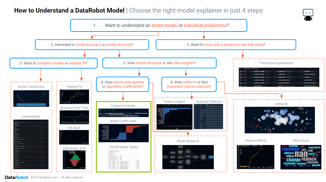
In the previous blogs from this series, we found how to assess the model accuracy, which columns and rows are important in the data, and discovered the patterns in the data that the model is using. In this blog, we will focus on the section of the cheat sheet marked in green above, discovering how to find and interpret model formulae for those situations where you absolutely must have a formula.
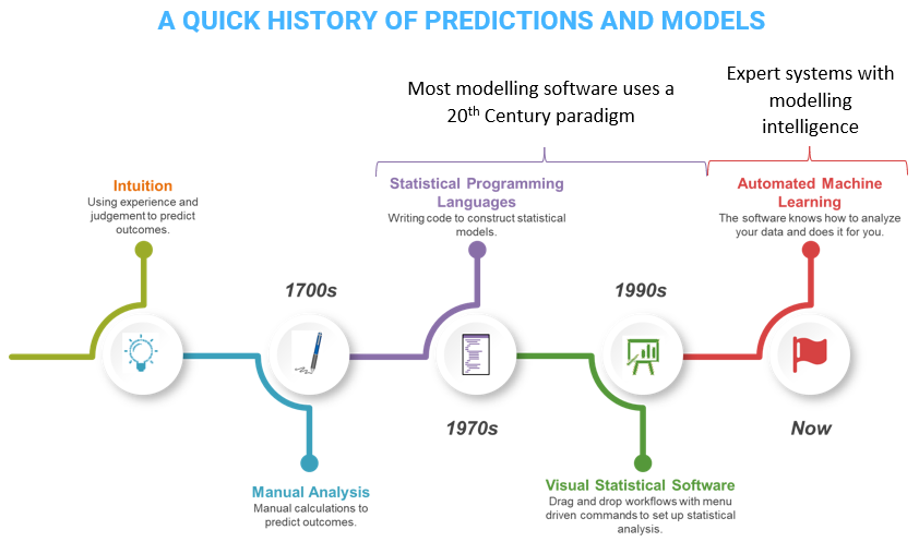
Historically, predictions and data-driven decisions weren’t so complex. Up until the 1700s, there was no theoretical basis for making data-based decisions, and consequently most decisions were based upon intuition and tradition. This changed with the development of statistical theory. Statistical methods were manually applied to scientific experiments, small in scale, with strict constraints upon the experimental design. It wasn’t until the 1970s that the first statistical programming languages were released, carrying out what had previously been manual calculations. Even when visual (drag-and-drop) statistical software was developed in the 1990s, the underlying analytic methodology remained unchanged. Statistical methods test a hypothesis expressed as a formula. Humans interpreted the results by looking at the formula. Models were deployed by applying the formula. This worked because the formulae were simple and rarely changed.
In the modern AI-driven organization, things have changed. Data-driven decisions are a competitive advantage, and data isn’t always collected in a manner that is consistent with the strict theoretical demands of statistical methods. Data volumes are higher, enabling organizations to build more complex models, and competition is fiercer, requiring more accurate models. The world is changing faster than ever, requiring models to be trained faster, and refreshed more often. Simple statistical formulae are not sufficient for modern AI-driven organizations.
Eureqa Formula
If your ultimate goal is to find a formula, then one of the best ways to achieve that goal is by using an algorithm that is specially designed to create a formula. The Eureqa blueprint leverages a proprietary evolutionary algorithm to automatically generate complex models as analytical expressions. Rather than taking an existing model structure and fitting the data to the model, Eureqa uses combinations of non-linear transformations to build highly accurate models from your data that can still be easily interpreted as simple mathematical equations. Eureqa models optimize parsimony, distilling the underlying patterns in your data with the least amount of complexity possible, even able to build the equation of motion from the observations of a double pendulum.
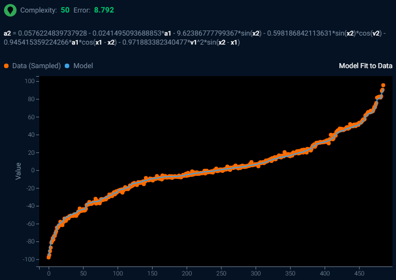
Above is a screenshot of the Eureqa output for a model fitted to observations of double pendulum movement. A double pendulum consists of two pendula attached end-to-end. In physics and mathematics, in the area of dynamical systems, a double pendulum is a pendulum with another pendulum attached to its end and is a simple physical system that exhibits rich dynamic behavior with a strong sensitivity to initial conditions. The motion of a double pendulum is governed by a set of coupled ordinary differential equations and is chaotic.
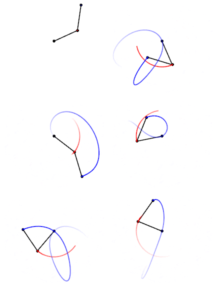
The animation of double pendulum movement shown above was created by 100Miezekatzen – Own work, CC BY-SA 3.0, https://commons.wikimedia.org/w/index.php?curid=25184171
In the Eureqa algorithm output, the higher the complexity score, the more complex the generated formula. You can find a simpler generated formula by selecting a lower complexity score from the training history. The lower the error score, the closer the formula matches the observations and the more accurate the formula. Immediately beneath the complexity and error score is the generated formula.
a2 = 0.0576224839737928 – 0.0241495093688853*a1 – 9.62386777799367*sin(x2) – 0.598186842113631*sin(x2)*cos(v2) – 0.945415359224266*a1*cos(x1 – x2) – 0.971883382340477*v1^2*sin(x2 – x1)
How to Interpret the Formula Above:
You will need a mathematical background in geometry and trigonometry to understand the sine and cosine functions used above.
The complex motion of the double pendulum can be expressed as an equation containing just six coefficients and six trigonometrical transformations.
Model Coefficients
Sometimes a simple formula is enough for your needs. Many statistical models are expressed as a simple linear formula, multiplying each input variable by a weight, then summing to get the prediction. A slightly more complex version of linear models is the generalized linear model (GLM) which applies a link function to constrain the range of the predictions. Linear models can also be found in machine learning, however machine learning takes a slightly different approach, and its linear models are regularized i.e., there is a penalty for the complexity of the formula. Linear models are often easy for people to understand, however that simplicity comes at the cost of poorer accuracy, particularly when the input variables interact with each other e.g., the effect of snow upon traffic speeds is different depending upon the geographic location and climate. Linear models are rarely as accurate as modern machine learning algorithms.
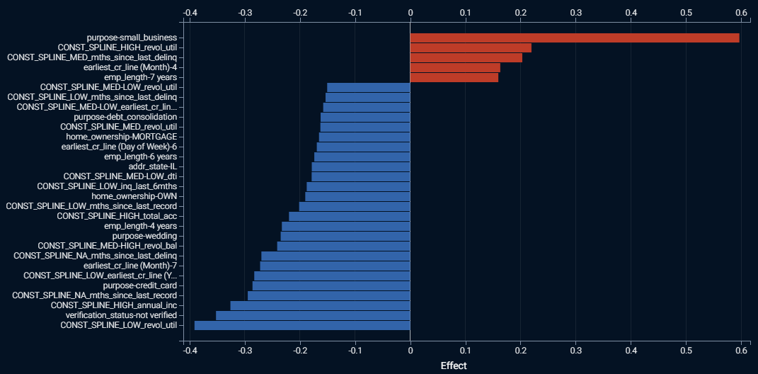
The screenshot above shows a bar chart of the strongest effects found within a regularized GLM trained on Lending Club’s loan data, predicting which personal loans will go bad. The red bars indicate positive effects, and the longer the red bar the higher the prediction. Similarly, the blue bars indicate negative effects, and the longer the blue bar the lower the prediction. The labels on the vertical axis are the feature names and the value that each feature takes. The horizontal axis is the linear effect, the coefficient or weight given for the presence of the feature value. Where you see the label “CONST_SPLINE”, that indicates that a numeric feature was split into bins or ranges. You can find the definitions for each range by downloading a table containing all of the model coefficients.
To create a formula, look for a blueprint with a i badge, then go to the coefficients tab and download the table containing all of the coefficients. Here is a snippet from the table corresponding to the bar chart shown above:
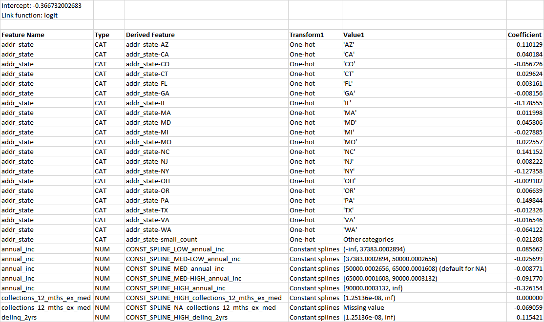
The table tells us the link function, each coefficient, and if the variable is numeric then the range of values the coefficient applies to. One can construct a formula by adding all of the coefficients times the feature values, then applying the inverse of the link function. If the link function is “log,” which is the case for regression models, then each coefficient can be translated into a percentage adjustment to the prediction. If the link function is a “logit,” which is the case for classification models, the coefficients cannot be translated into percentage adjustments to the prediction.
How to Interpret the Coefficient Table Above:
-
Since the link function is “logit,” this is a classification model that predicts probabilities.
-
You will need a mathematical background in generalized linear models to understand the link function and construct a formula. The inverse logit function is

-
The alpha value used in the link function is calculated by summing the intercept, plus each coefficient multiplied by its corresponding feature value, giving a long formula:
α = -0.366732002683 +
0.110129×if(addr_state=’AZ’,1,0) +
0.040184×if(addr_state=’CA’,1,0) +
…+
0.085662×if(-∞<annual_inc<37383.0002894,1,0) +
-0.025699×if(37383.002894≤annual_inc<50000.0002656,1,0) +
…+
-0.040994×if(zipcode=’112xx’,1,0) -
You will need a mathematical background to understand and explain this formula.
As you can see, just because a formula has a simple structure, it doesn’t mean that it is always easy for people to understand completely. It is recommended that if you have to explain a linear formula to a non-technical business person, that you focus on discussing which effects are strongest, and which increase or decrease the prediction.
Generalized Additive2 Model – Rating Tables
As noted above, linear models sacrifice accuracy for a simpler structure, primarily because they ignore interaction effects. But sometimes you want both accuracy and a linear structure. This can be the case in insurance and banking, where the regulator is expecting model submissions to be in a linear format. When you want accuracy plus transparency, generalized additive2 models (GA2Ms) are an attractive option. All of the coefficients, including for text and interaction effects, are available for download as a “rating table”.
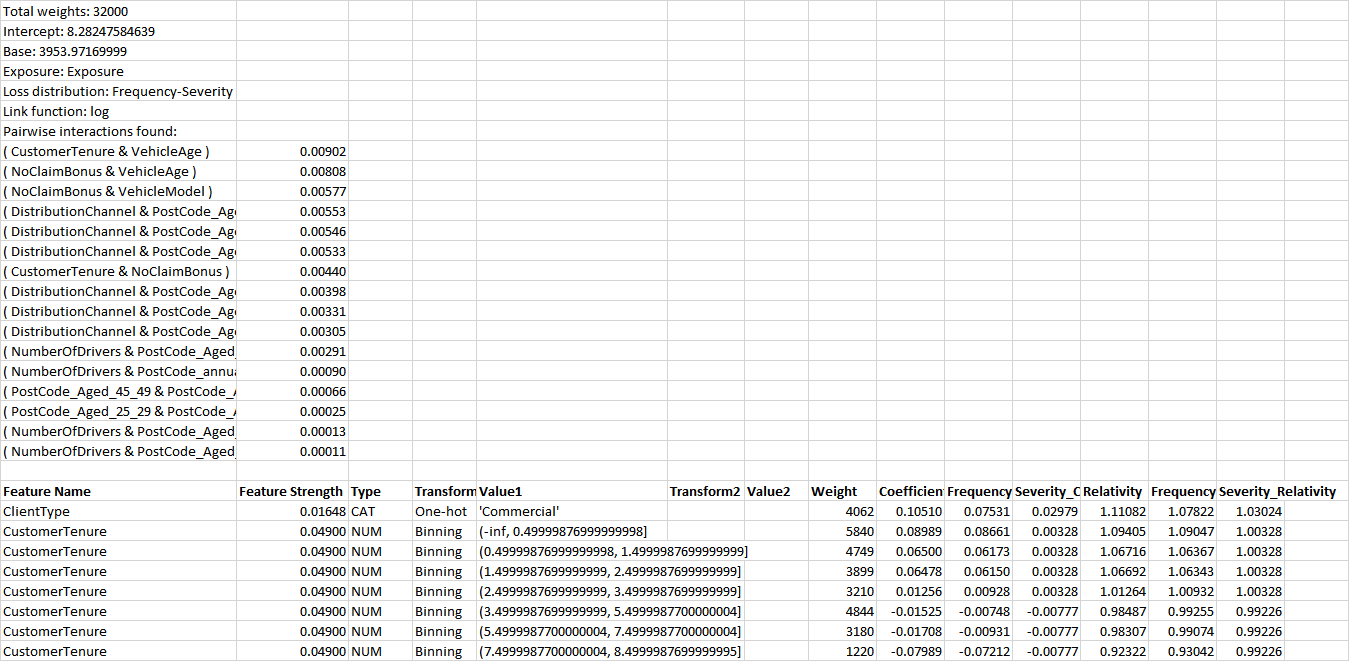
Above is an excerpt from the rating table of a GA2M trained on insurance data, to predict claims costs per insurance policy. Just as with model coefficients tables for regularized GLMs, the rating table tells us the link function, each coefficient, and if the variable is numeric then the range of values the coefficient applies to. Unlike regularized GLMs, it also shows interaction effects, the coefficients for combinations of two different features, listing them from the strongest effect to the weakest. One can construct a formula by adding all of the coefficients times the feature values, then applying the inverse of the link function. If the link function is “log,” which is the case for regression models, then each coefficient can be translated into a percentage adjustment to the prediction. If the link function is a “logit,” which is the case for classification models, the coefficients cannot be translated into percentage adjustments to the prediction. For regression models, the rating table will include multiplicative relativities that correspond to the coefficients.
How to Interpret the Rating Table Above:
-
Since the link function is “log”, this is a regression model that predicts probabilities.
-
You will need a mathematical background in generalized linear models to understand the link function and construct a formula. The inverse log is the natural exponential.
-
The value used in the link function is calculated by summing the base, plus each coefficient multiplied by its corresponding feature value, giving a long formula:
x = 3953.97 +
0.10510×if(ClientType=’Commercial’,1,0) +
0.08989×if(-∞<CustomerTenure<0.49999,1,0) +
…+
…+
0.00568×if(DistributionChannel=’112xx’ AND PostCode_Aged_40_44=NA,1,0) -
You will need a mathematical background to understand and explain this formula.
As you can see, just because a formula has a simple structure, it doesn’t mean that it is always easy for people to understand completely. It is recommended that if you have to explain a rating table formula to a non-technical business person, that you focus on discussing which effects are strongest, and which increase or decrease the prediction. You may also choose to plot the interaction effects as a heat map or a 3D plot. Examples of such plots can be found here. For non-interaction effects, DataRobot automatically provides feature effects plots.
Conclusion
The path to trusting an AI includes knowing whether the patterns it is using are suitable and reasonable and knowing which input features the model is using to determine high or low predictions and yes or no decisions. But a mathematical formula, even on a relatively “simple” model can be inscrutable to business people. Whenever you are asked to explain the model, your preferred path should be to show visual insights of what is important in the data, and what patterns the model found and used in the data. But sometimes you have no choice but to use a formula. If your AI can’t give you the option to show a formula, then it’s time to update to DataRobot for models that you can trust. Click here to arrange for a demonstration of DataRobot, showing how you can trust an AI.

VP, AI Strategy, DataRobot
Colin Priest is the VP of AI Strategy for DataRobot, where he advises businesses on how to build business cases and successfully manage data science projects. Colin has held a number of CEO and general management roles, where he has championed data science initiatives in financial services, healthcare, security, oil and gas, government and marketing. Colin is a firm believer in data-based decision making and applying automation to improve customer experience. He is passionate about the science of healthcare and does pro-bono work to support cancer research.
-
Choosing the Right Vector Embedding Model for Your Generative AI Use Case
March 7, 2024· 8 min read -
Reflecting on the Richness of Black Art
February 29, 2024· 2 min read -
6 Reasons Why Generative AI Initiatives Fail and How to Overcome Them
February 8, 2024· 9 min read
Latest posts
Related Posts
You’ve just successfully subscribed


